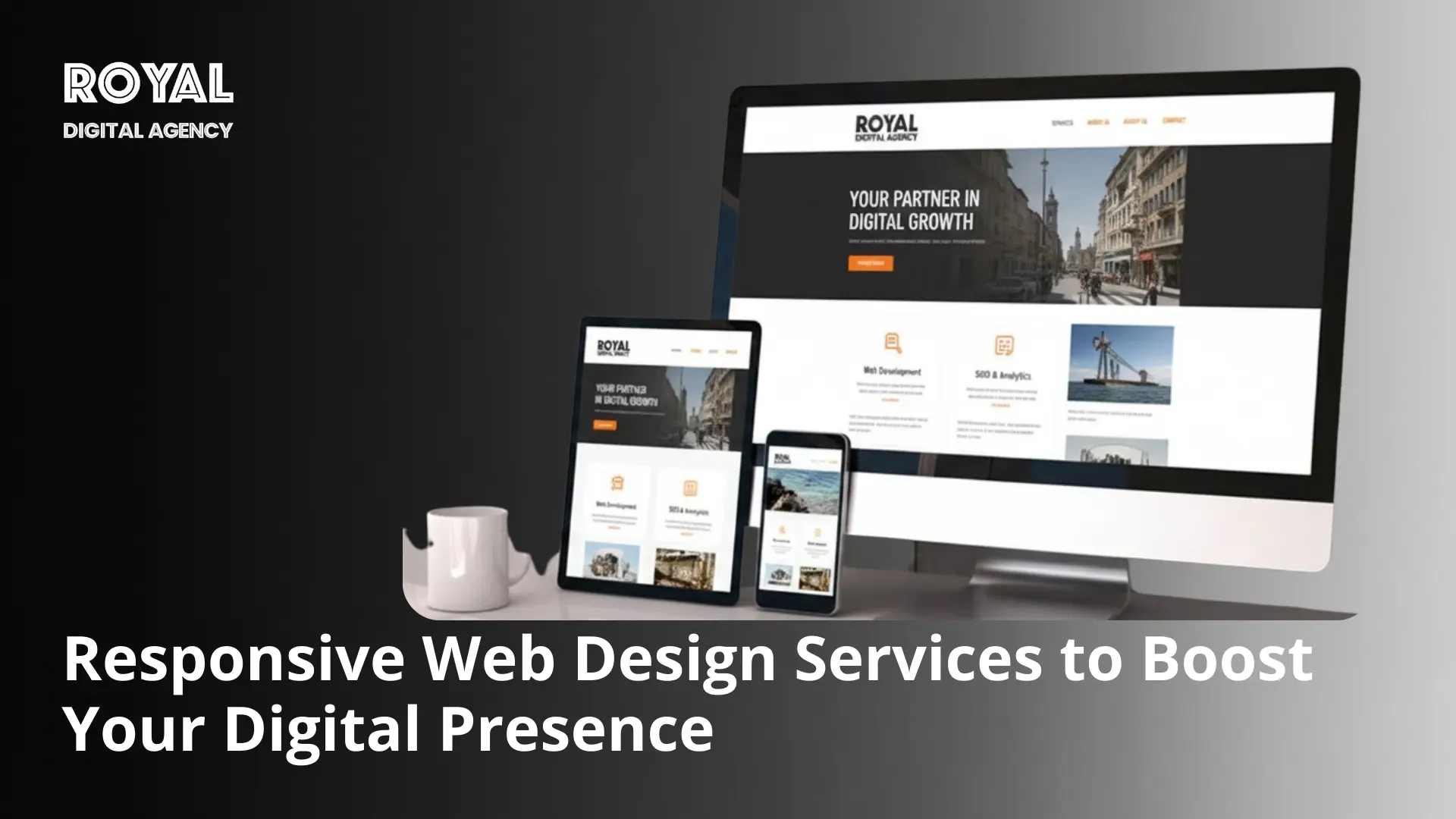
Businesses today flourish in a digital world where user experience makes the difference. A website that does not function well in all devices loses visitors before they even see what you’ve got to offer. That’s why responsive Web Design Services are such an essential service to companies looking to be competitive and accessible on the Internet.
Responsive design automatically adjusts the website to fit various screen sizes to provide a consistent and intuitive user experience no matter which device is used: smartphone, tablet, laptop, or desktop. Statista states that mobile devices will account for over 59% of the total web traffic in the world in 2025, which makes mobile compatibility a necessity, not a luxury.
This guide explains the principles, technologies, and strategic benefits of modern responsive website design services and shows how businesses can create future‑ready digital experiences.
What is Responsive Web Design?
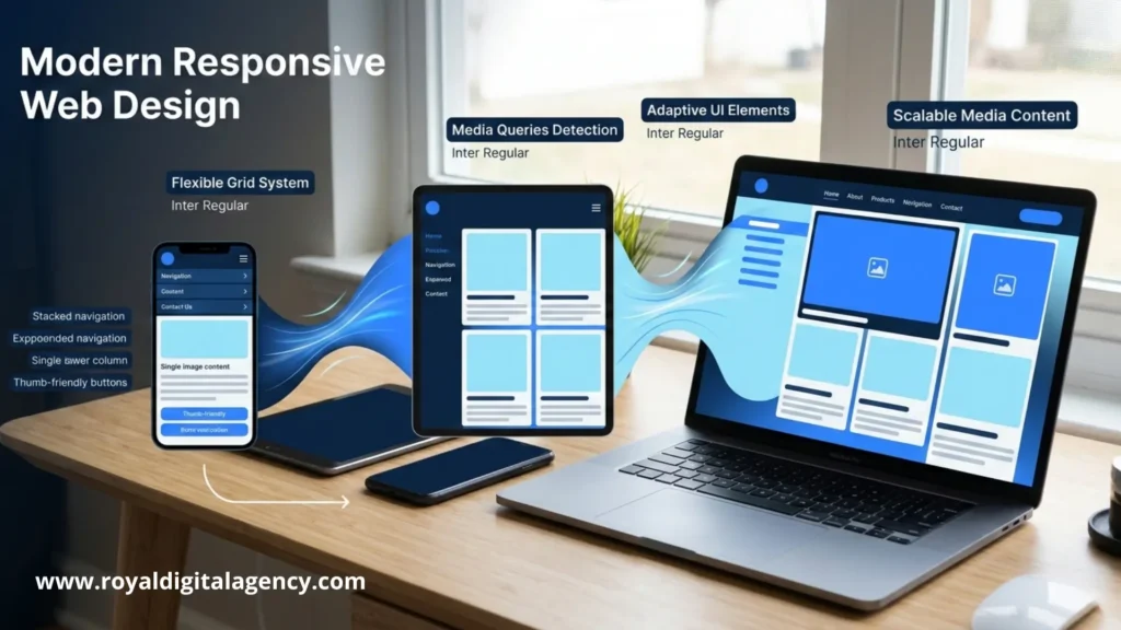
Responsive web design causes the websites to adapt to any screen size and provide the same experience to the users on the phones, tablets and desktops.
It’s a method of development which allows layout, content and features to change dynamically according to the device used by the user. Rather than having separate desktop and mobile websites, with responsive design all websites have flexible layouts and use adaptive techniques to make websites usable for all screens.
A professional responsive developer will create a site that has flexible grids, scalable images and CSS media queries. These tools allow the elements to resize and move automatically.
For businesses, this means that visitors do not have to zoom, pinch or scroll like a snake or anything horizontally. The design shifts naturally without impacting the brand consistency and readability.
By leaving their websites to a trusted responsive Web Development Company, businesses have websites that provide seamless user journeys and increased user engagement across devices.
Core Principles of Responsive Design
Responsive design is based on the idea of flexible layouts, scalable media and device specific styling that allow a site to adjust itself automatically. Modern responsive web design companies rely on three fundamental technical principles.
Flexible grid systems use percentages instead of pixels so that the elements can grow or shrink with the screen.
Fluid images scale proportionally so that they are not broken in the layout on smaller screens and also retain their clarity.
CSS media queries recognize width, orientation, and resolution and style for individual devices.
Together, these principles enable a responsive design company to offer sites that are functional and visually consistent everywhere.Ready to make responsive web design join,
Evolution of Website Design
Website design moved from a strictly desktop design to a dynamic system that works with many devices.
Early sites were designed for fixed width desktop monitors. When smartphones came out these sites often looked broken and difficult to navigate.
By the early 2010s, the solution to this problem was fluid layouts and flexible media being created by developers. Responsive design rapidly became the industry standard and it enabled one site to serve all devices.
Today, Website Development Services form the backbone of modern digital strategy. The recent adoption of mobile-first indexing by Google pushed the adoption level even higher, by ranking mobile-optimized sites higher.
Companies collaborating with seasoned responsive developers no longer need to maintain multiple device-specific versions of a site, but instead maintain one scalable site.
Mobile‑First Approach
A mobile-first design prioritizes the usability of smartphones, and then moves on to tablets, laptops and large desktops.
Designers always work with the smallest possible screen, with the essential content, navigation and performance.
Once the mobile layout is solute additional layers are added for bigger screens but the core features remain accessible everywhere.
Google’s algorithm has a huge preference for mobile optimized sites. In front of all this, in 2024, Google has confirmed that mobile-first indexing is applied to almost all sites in its index.
Thus, more businesses are partnering the responsive design firms that build mobile-first experiences that are scalable on multiple platforms.
Benefits of Responsive Web Design Services
Responsive design enhances usability, boosts SEO and saves money in development and provides consistent brand experiences across all devices.
Investments in professional responsive design bring measurable advantages to businesses in terms of user engagement and visibility online.
Improved User Experience
A responsive layout allows visitors to move around a site with ease regardless of the size of the screen.
Users expect to load fast and the display to be clear. Sites that make users have to zoom or scroll constantly will cause them to leave a site within seconds.
Responsive design removes these issues by dynamically changing menus, text and visuals.
Some of the key benefits of user experience are:
• easier navigation across devices
• improved readability on smaller screens
• consistent design across platforms
• faster loading performance
These improvements increase interaction between visitors and motivate them to explore further.
Enhanced SEO Performance
Search engines give precedence to mobile-friendly sites, and hence responsive design is an important ranking indicator.
Google repeats over and over again that mobile usability is a very important signal. Responsive sites tend to perform better in the search results.
A single URL structure makes SEO easier, as opposed to separate mobile and desktop pages.
Additional SEO benefits are:
• Faster page speeds
• Lower bounce rates
• Easier to crawl and index
• improved user engagement signals
A trusted developer will be able to include SEO best practices in the design from the beginning.

Cost-Effective Website Solutions
Maintaining a single responsive site is much more efficient than having multiple versions for multiple devices.
Before responsive design, companies used to build their own mobile sites which increased their development costs and made updates to them very difficult.
Responsive design removes that problem by designing a one-size-fits-all site.
Benefits include:
• lower development and maintenance costs
• simplified content management
• faster updates and improvements
• scalability for future devices
For growing organizations, responsive design services are a long term investment in digital efficiency.
Key Features of Professional Responsive Web Design
Professional responsive web design is used for adaptive layouts, flexible media and responsive and smooth working navigation on every screen. High quality providers incorporate technical features that ensure their proper functionality across all devices.
Fluid Grid Layouts
Fluid grids let website structures scale naturally while keeping visual balance and readability. Traditional fixed layouts made use of pixel dimensions; fluid grids make use of percentages. This allows columns and sections to be able to resize proportionally as the screen size changes.
Benefits include:
• consistent layout structure
• flexible spacing and alignment
• improved compatibility with new devices
• improved accessibility
These grids build the structural framework of making responsive design possible.
Flexible Images and Media
Responsive sites that must adjust the content of images and media depending on screen size without any quality or performance loss. Flexible media is an element that automatically adjusts the size of graphics, videos and other visual content depending on the size of their container.
Typical techniques:
• responsive image attributes
• CSS scaling rules
• lazy loading
Lazy loading helps to delay the loading of the image until the user scrolls nearby, which enhances page speed and reduces the use of bandwidth. Google claims up to 35 per cent drop in initial load on mobile.
Adaptive Navigation Menus
Navigation has to change structure depending on the size of the device but remain intuitive. Menus on desktops are all horizontal, but on smart phones menus are reduced to icons or expandable lists.
Common solutions:
• hamburger menus
• slide‑out panels
• collapsible dropdowns
These help the users to reach key pages without clutter.
Our Responsive Web Design Process
Royal Digital Agency has a structured process that combines research, strategy and development to create high performance responsive sites. A professional firm combines technical precision and user centeredness.

Discovery and Planning
Every project begins with some research to establish goals, needs of the audience, and technical specifications. Our team reviews:
• business objectives
• target audience behavior
• competitor sites
• industry design trends
This phase spotlights differentiation opportunities and ensures the website aligns with the client’s goals. We also set some performance standards such as page-load times or devices compatibility.
Wireframing and Prototyping
Wireframes are used to plot the basic structure of the page without the visual style. Interactive prototypes are then used to simulate how users will navigate around the devices. Stakeholders review:
• content placement
• navigation structure
• user flow
• responsiveness
Early adjustments minimize subsequent retards in development.
Design Implementation
During the development stage, designers and engineers take the approved prototypes and develop them into fully functional responsive sites. We implement scalable coding practices and new frameworks, and focus on:
• clean, maintainable code
• responsive component systems
• optimized loading
• cross‑device testing
Extensive testing is done to ensure reliable performance on browsers and screen sizes.
Popular Technologies and Tools Used
Responsive design relies on modern tech that promotes adaptability, speed and scalability.

Front‑end Stack and CMS
The technical foundation is built using HTML5 and CSS3, which help create modern, fast, and user-friendly websites. HTML5 structures the website content and supports multimedia features without requiring external plugins. CSS3 is used to manage the layout, styling, and responsiveness across different devices. These technologies are essential in modern Website Redesign Services, helping improve site performance, mobile compatibility, and overall user experience.
• media queries
• flexbox
• CSS grid
These enable developers to design complex designs that are easy to adapt.
Performance Optimization
Fast loading is of the utmost importance, especially on mobile. Google prefers website users that leave pages that take longer than three seconds. Key techniques:
• image compression
• script minification
• caching
• lazy loading
JavaScript Frameworks
Dynamic interfaces are based on modern frameworks. Popular options:
• React – component based, scalable
• Vue.js – lightweight interactive
• Angular – enterprise‑grade
Frameworks allow sites to update site content without reloading entire pages, but instantly.
Content Management Systems
CMS makes the management of a site easier, as well as making it work with responsive layouts. Common platforms:
• WordPress
• Drupal
• Shopify
• Webflow
Many of the companies implement headless CMSs that separate content management with presentation, providing consistent content across sites, apps and other digital platforms.
Industries We Serve
Royal Digital Agency works in response design while considering the distinct needs of different sectors so that it is reliable for a digital experience.
Technology: Tech companies require clean and modern interfaces that clearly present complex products. Responsive design facilitates the demos of products and improves onboarding.
E‑commerce
Online stores need to work perfectly on mobile, where the majority of shopping takes place. E‑commerce design focuses on:
• optimized product pages
• mobile checkout
• fast‑loading images
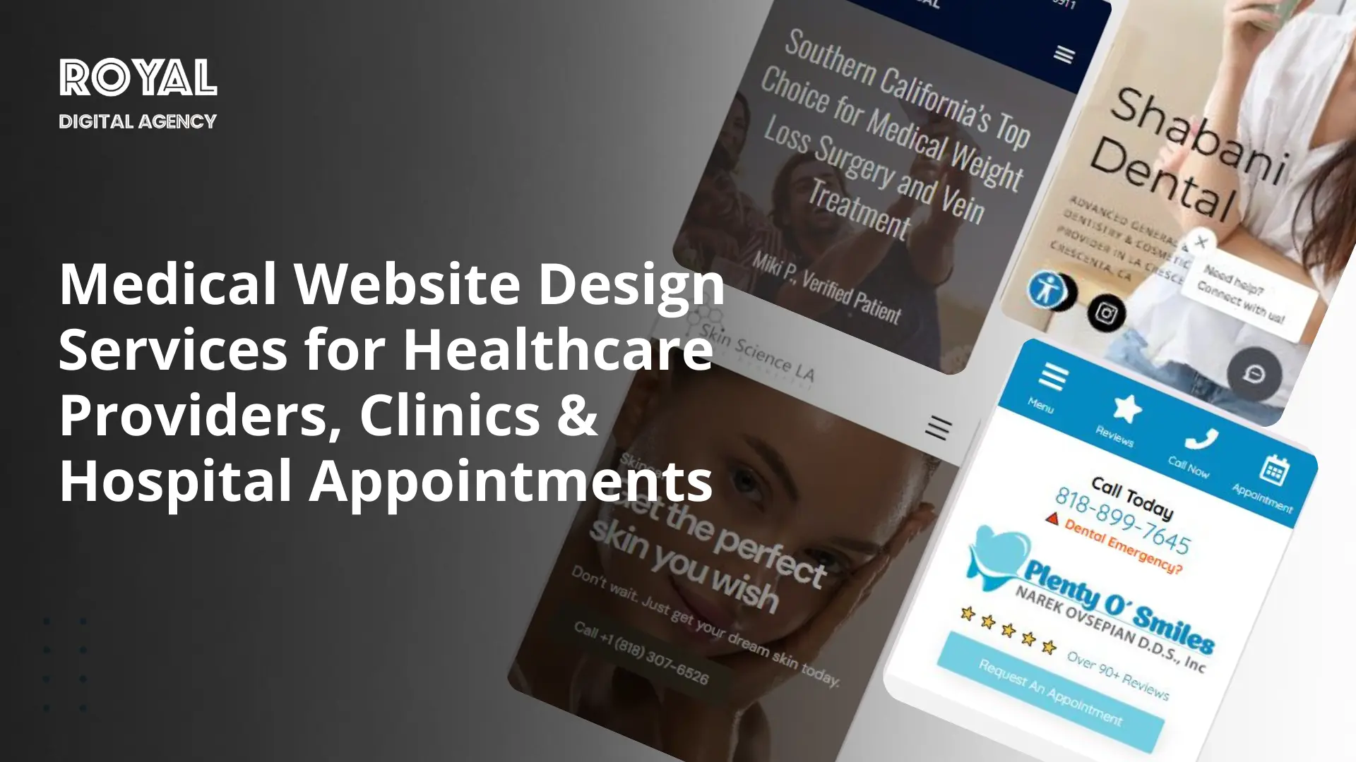
Healthcare: Healthcare sites must be accessible to patients so that they can locate services and schedule an appointment quickly from any device.
Finance: Financial platforms are trust-based, secure, and user-friendly. Responsive sites are clear in navigation and structured in the information they present when it comes to complex services.
Education: Educational organizations have the advantage of using platforms that facilitate learning across devices. Students and teachers can access materials without any issues on phones, tablets, and laptops.
Why Choose Our Responsive Web Design Services
Royal Digital Agency combines strategic design, scalable development and continual support in building high performance, responsive digital platforms.
Choosing the right responsive web design partner is crucial in long term digital success.
Customized Solutions
Every organization has different goals, target audiences and technical needs. Our team builds websites that mirror each client’s brand identity and business strategy, avoiding generic templates. Custom solutions enable businesses to expand their sites as new features or services are released.
Expert Team
Royal Digital Agency operates as a full‑service responsive web development company with specialists in
• UX design
• front‑end development
• back-end development
• SEO integration
• performance optimization
This multi-faceted expertise allows us to develop sites with a combination of visual creativity and technical precision.
Ongoing Support
Launching a website is only the first step toward a successful digital strategy. Our current ongoing support services include
• performance monitoring
• security updates
• technical maintenance
• continuous optimization
These services will ensure that sites remain secure, fast and up-to-date with changing technologies.
Ready to Transform Your Website?
Your website often delivers the first impression potential customers have of your brand online.
Responsive design is the solution to see that impression remains strong regardless of the device the visitors access it on.
By partnering with Royal Digital Agency you get a responsive – design partner who is performance, usability and long term scalability driven.
Our services combine user-centric design with new-age development frameworks to develop a growing platform for your business.
Key benefits include
• smooth performance across devices
• faster loading speeds
• improved search visibility
• scalable website architecture
As a leading responsive web design agency, Royal Digital Agency supports businesses in building flexible digital experiences that remain competitive in a shifting online landscape.
If you’re ready to boost your digital presence, our team can design and build a beautiful, fully responsive website.
Frequently Asked Questions
1. How long does it take to build a responsive website?
The timeline is dependent on complexity of features and content. A typical responsive website takes between 4-8 weeks, depending on the size of the site, with larger custom websites and complicated UX taking several months.
2. Does responsive web design improve website conversion rates?
Yes. Responsive sites make the site more usable on any device so that visitors can easily browse, read, and do more. Better navigation, quicker load and mobile optimization result in a higher engagement and conversion rate.
3. Is responsive design necessary if my audience mostly uses desktops?
Even if it’s most visitors that access your site on desktop, responsive design future proofs your site. Mobile traffic is on the rise globally and mobile-friendly websites are prioritised by search engines so websites must be mobile-friendly for visibility and accessibility.
4. Can an existing website be converted into a responsive design?
Yes. Developers are able to re-design or rebuild a site with responsive frameworks and modern CSS. Older sites may require some structural modifications in order for layouts, images, and navigation to adapt accordingly to different screen sizes.
5. How does responsive design affect website maintenance?
It makes it easier to maintain because you don’t have to maintain a mobile site and a desktop site. Updates, security patches and content changes are once and for all which will save time and money in the long term.
6. What role does testing play in responsive web design?
Testing insures that the site works the same on all browsers, operating systems and devices. Developers rely on real-device testing and simulation tools to identify issues in the layout, loading and interactions of the product before its launch.
7. How often should a responsive website be updated or redesigned?
Most sites benefit from updates every 2-3 years to keep up with the changing standards for design, new browser technology and user expectations. Regular performance audits and small improvements can keep a site optimized between major redesigns.